4Creative & Jonathan Glazer Give Channel 4 a Fresh New Look

Channel 4 unveiled a brand new look for its main channel on Tuesday 29th September 2015, featuring new idents inspired by the deconstruction of the iconic Lambie Nairn 4.
4Creative, the broadcaster’s award-winning in-house creative agency, is behind the innovative concept of the refreshed identity alongside creative agency DBLG.
The refreshed identity reflects Channel 4’s public service remit focussed on innovation, diversity and taking creative risks and is the latest evolution of a brand that has existed in its current form for over a decade.
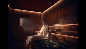
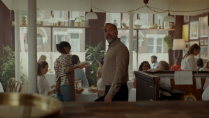
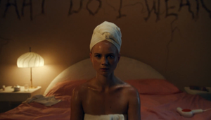
The channel’s new idents demonstrate an innovative new take on the Channel 4 logo. 4Creative collaborated with Academy Films who produced this part of the project. Director Jonathan Glazer took the original brief and crafted a story, writing and directing the set of films; a four-part narrative that is to be continued…
Globally renowned graphic designer Neville Brody (The Times London, Yamaha, Christian Dior, Samsung, Converse, GAP, Nike, Royal College of Art) was commissioned to cut two exclusive new typefaces for Channel 4 named Horseferry (for display) and Chadwick (for information). These can be seen as part of the channel’s refreshed on-screen graphics (e.g. end of programme credit panels, branded stings, menu information graphics and programme title cards) as well as its bold new off-air/poster art direction.
The new on screen identity for Channel 4 will be visible across programme brands that currently incorporate the channel’s branding including Channel 4 Racing and Channel 4 News – for which a brand new title sequence launches on Wednesday 30th September.
Mica Levi, aka Micachu, of Micachu and The Shapes, (Under the Skin) composed the music to the idents. She is currently an Artist in Residence at London's Southbank Centre.
At the same time as refreshing the identity of the main linear channel, Channel 4 is introducing an updated corporate brand to reflect the whole network of channels and services it delivers.
This brand identity uses the new multi-coloured 4 logo reflecting all the channel brands which was first introduced to launch All 4. This will now be used on all corporate and network branding. The name of the corporation will remain Channel 4 Television Corporation.
James Walker, Head of Marketing, Channel 4 said: “Channel 4’s main channel identity has been running for ten years and has been hugely successful. This ground breaking brand refresh pushes it forward once more, reflecting our public service remit to be diverse, challenging and innovative.”
Chris Bovill and John Allison, Heads of 4Creative said: “Most TV branding these days is like watching wallpaper. It’s pleasant but gets boring very quickly. However, Channel 4 is much more than just a big shiny number and some nice vibes. We didn’t want to tell people what channel they’re watching. We wanted to tell them why they’re watching it the first place. They watch because Channel 4 stands for something important. We wanted the new branding to reflect this.
"We started with the original, iconic Lambie Nairn 4 logo and broke it down into its constituent parts; the nine blocks. The blocks represent Channel 4’s incredibly diverse qualities. The blocks are free to demonstrate our remit; to be irreverent, innovative, alternative and challenging. They are free to flow through everything on the channel: our typeface, on-screen menus, on-screen graphics, off-air logo, Channel 4 News, Channel 4 Racing, all the way through to the idents.
The idents present the blocks as kryptonite-like. They tell the story of their origin and how they have a powerful impact on the world around them. Just as Channel 4 does. It is a story that we shall build on. It’s been an incredible honour to work on such a loved brand, a brand very close to our hearts. Hopefully we haven’t let the viewers down.”
Neville Brody said: “It has been an honour to be asked to design and produce the core font for on- and off-air for this modern iconic UK broadcaster, one that has had a significant affect on British taste and capacity for extreme, irreverent ideas. I have always loved and respected the pioneering and influential brand design that Martin Lambie-Nairn created, Having followed the growth and evolution of the channel from its birth and position as a vital rebellious independent cultural space, a place it has been loyal to and strengthened even more over time, I am proud to have been involved in helping to develop the new visual language for the channel to help take it forward for the next decade.”
Grant Gilbert, Creative Director, DBLG said: “We decided early on that we didn’t want to mess with the logo but instead find different ways to present it on air. The OSP and opticals aren't just promos with a logo tacked on the end; they are the channel. These elements that play out dozens of times every day are now free to be playful, surprising, dynamic and ever changing. We have created an identity for Channel4 that has longevity and will evolve and express itself in different ways.”


