Attention to Detail Led Starbucks’ Creative This Christmas, says TBWA\London

With its latest holiday campaign, 'Drink In, Breathe Out', Starbucks offers a unique take on the festive season, inviting customers to embrace moments of calm amidst holiday chaos. Created by TBWA\London and Blink's directing duo Andy & Adeena, the campaign positions Starbucks as a warm haven amid the hectic holidays, using the storyline of a modern man navigating the season's whirlwind to highlight how a Starbucks moment can reconnect people to what matters most. A mixed-media TV spot—featuring a blend of 3D sets, stop-motion, and 2D animation—captures this balance with a whimsical, handcrafted charm, thanks to the intricate work of animation studio Blink.
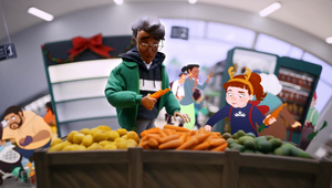
Starbucks collaborated with animation studio Blink, crafting intricate 3D sets, stop-motion scenes, and 2D characters to convey both the excitement and exhaustion of the holidays. TBWA’s creative director, Lauren Coates, notes that the animation enabled a whimsical take on these holiday dynamics, creating a handcrafted feel that brings authenticity to the story’s chaotic journey and peaceful resolution. From holiday shoppers to spirited office party attendees, every detail and character was carefully crafted to reflect relatable, real-life moments of the season.
Lauren Coates and strategy director Jesper Norgaard collaborated closely with Andy & Adeena to ensure each detail, from tiny red cups to a bustling “rolling road” set, brought authenticity to the campaign. Blink’s team faced the challenge of combining multiple animation techniques, making protagonist George relatable yet endearing. By animating a seamless shift from frenzy to calm when George takes a sip of his Starbucks, Blink’s directors highlight Starbucks’ role as a comforting refuge during the busiest season.
LBB’s Zoe Antonov speaks today with Andy & Adeena, Lauren Coates, and Jesper Norgaard to learn more about how they developed this unique holiday vision.
LBB> What was the initial creative vision behind ‘Drink In, Breathe Out’, and how did it evolve into the final concept of holiday chaos juxtaposed with moments of calm?
Lauren> We explored lots of different ways to do this, but ultimately, we felt a powerful solution would be to bring to life the role that Starbucks plays in people’s lives during this important time of year – a calm moment amongst the holiday chaos. We knew we could have a lot of fun with staying true to the way people see the holidays. We just needed to find the right role for Starbucks without it feeling like a gimmick.
LBB> How did you collaborate with Blink to ensure that the animation style captured Starbucks' brand values, especially the balance between holiday excitement and serene moments?
Lauren> It really was a huge collaboration from start to finish, from agency, production and Starbucks themselves. We had the story and on paper it could be interpreted multiple ways but it was really director duo Andy & Adeena that brought that sparkle to it. We knew animation would be a great way to capture all the emotions of the holidays but the combination of stopframe, 3D sets and 2D animated characters turned it up to eleven and that’s what’s been great about working with Blink. They saw the potential of where the idea could go and we trusted their vision.
It was amazing to see the details come together. Everything was carefully considered, from the tiny red cups in our 3D Starbucks store to the intricate stitching on George’s jacket. It was such a special project, we all wanted a little piece of the shoot to come home with us. In order to really nail the story, we had to land that shift between chaos and calm. Building up the franticness and mayhem was super important so that when we finally reached Starbucks, everything could slow right down and that serene moment of reconnect really came across.
LBB> What was the most challenging aspect of combining 3D sets, stop-motion, and 2D animation in this campaign, and how did you approach balancing these different techniques?
Andy & Adeena> Combining the animation techniques was pretty tricky! We had to make sure that George’s interactions with his 2D entourage all perfectly lined up when we animated him. Using a mixed media approach meant that George really feels as if he is at odds with the world and those around him. It also made sure George was highlighted and singled him out as the star of the show. The end results turned out dreamy so this approach was totally worth it.
LBB> Given Starbucks’ emphasis on fostering connection and community, what was the thought process behind positioning it as a 'haven' during the busy holiday season?
Jesper> It started out with a desire to portray a true reflection of how people actually experience the holiday season, which is not always the glittering and joyous version that’s so often shown in holiday ads. Our research has shown us that the season is full of a whole range of different emotions – people find the season rather stressful at times and it can also be quite demanding – and Starbucks plays an important and meaningful role during this time of year. Starbucks is a warm and welcoming place where you can slow down with a festive drink (try the Caramel Waffle Latte – yum!) and connect with the holiday spirit and the people you love – people see it as a comfy haven in the festive storm. So, as I said, we wanted to portray a true reflection of the season and Starbucks’ role within it.
LBB> What specific details or elements in the animation do you feel add to the “magical, tactile quality” that TBWA\London mention?
Andy & Adeena> Personally we think the interaction between George and the 2D characters are pretty magical, like for example when he grabs the pen from his daughter. Moments like this were quite technically challenging to do so it’s really rewarding to watch those moments play out on screen.
LBB> How did you arrive at the idea of using a 'busy modern-day man' to capture the holiday rush, and what insights shaped his character and journey?
Jesper> We wanted to mirror Starbucks’ inherent modernity and inclusivity which is why we portrayed our main character as a modern man who loves his family and is actively engaged in making the big day come together. It was important to us that his journey would resonate with people, which is why we decided to feature scenarios people would recognise from their own lives during this season: the chaos at home, the awkward office party, the last-minute shopping trip.
LBB> Can you walk us through the process of designing George? How did you make his journey visually convey the chaotic yet festive atmosphere of the holidays?
Andy & Adeena> We had an incredible character designer who helped hugely with this process. We wanted George to feel like he was clearly nailing the festive season while still being a little flustered. It was a delicate balance to get his look right, we didn’t want him to feel too frumpy but he also couldn’t look too cool! We feel like we landed in the sweet spot making George a pretty lovable and relatable guy.
LBB> With such intricate craftsmanship involved in creating the campaign, what elements or details are you most excited for audiences to notice?
Lauren> It’s proper craftsmanship. There’s so many insightful human moments in the film, while also displaying the warmth and comfort you feel in a Starbucks. The mastery really comes through when you notice what’s going on around the main character. From a shopper’s despair at an empty shelf to an office worker flossing. The little girl nibbling the carrots and putting them back in the supermarket has to be my favourite. Reminds me a lot of myself. If the carrots were pick ‘n’ mix. And she actually just ate the whole lot. Even though we’re showing the chaos of the holidays, it doesn’t mean we can’t have a bit of fun with it. We’ve got something or someone everyone can relate to. Every time you watch it you’ll discover something new.
LBB> How did you achieve the transition effect where everything "slows down" after the character takes a sip of his Starbucks beverage? What techniques were key in creating that moment of calm?
Andy & Adeena> Throughout the spot, we had the characters moving at quite a frantic pace. As we move into Starbucks, the characters are a lot slower which creates a sense of peace and calm.
We also had a long slow camera move that tracks in on George which helped to keep the focus on him. It actually took us a couple of takes to get George’s drink and sigh of relief right as it was really important that we nailed this to show that during his Starbucks interval he felt calm once again. We then animated him straightening his glasses as if to say, 'I have regained control, relaxation has been achieved and I’m ready to get back out there again!'.
LBB> What were the creative inspirations behind the travelator sets, and how did they contribute to the storytelling?
Andy & Adeena> 'Rolling roads' or curved sets have been used loads of times in stop motion but normally with the curve positioned coming towards the camera. However, we unconventionally spun our rolling road 90 degrees to give the impression that our protagonist; George, was having to move from set to set on some kind of massive, out of control hamster wheel. By doing it in this unusual way, the focus stayed consistently on George. So even though the worlds he’s moving through are extremely frantic and busy, he’s always the star of every shot!
LBB> How did you tackle the intricacies of animating mini versions of Starbucks’ iconic Red Cups and other brand elements?
Andy & Adeena> The brand elements were very satisfying to make. Our incredible art department had real life size versions of the Starbucks products so they could replicate them as realistic and accurate miniatures. There are so many tiny details in this advert, you’ve just got to spot them!
LBB> How did you ensure the campaign resonates across the diverse EMEA region while still preserving Starbucks' core brand identity?
Jesper> It can often be a challenge to come up with something that resonates across an entire region, but the good thing about the holidays is that when you elevate above specific market nuances and traditions, we all go through a similar, somewhat stressful experience. And as a global brand, Starbucks isn’t that different across the markets either – it doesn’t matter whether you’re in Soho or Strasbourg, you’ll always be welcomed in with a warm smile and served a delicious, handcrafted drink, helping you slow down and reconnect. Leaning into this shared experience enabled us to craft an ad that can travel across borders. And of course, by sprinkling much-loved Starbucks cues throughout the ad – the green jacket, the iconic red cup, the warm welcome from the barista, even the siren toy. We tied it all back to Starbucks.
Andy & Adeena> To make each animates scene resonate across the region, we just wanted to include as much detail as possible, this is an advert you will have to watch multiple times to see all of the juicy little details. We wanted it to feel rich and engaging with a huge cast of diverse and varied characters. Hopefully viewers will see at least one character in this film that they might relate to in some way!
Andy & Adeena> To make each animates scene resonate across the region, we just wanted to include as much detail as possible, this is an advert you will have to watch multiple times to see all of the juicy little details. We wanted it to feel rich and engaging with a huge cast of diverse and varied characters. Hopefully viewers will see at least one character in this film that they might relate to in some way!


