How Gary Levesque Let the ‘80s Vibes Rip for Nike Football

Earlier this month, we were bowled over by Wieden+Kennedy’s epic, time-travelling Nike Football campaign in anticipation of the Women’s World Cup.
Entitled ‘What The Football’, the campaign featured a central anthem spot, which was preceded by six supporting films, each of which focused on a different athlete. One of those athletes with USA star Megan Rapinoe, whose dedicated film is an uber-‘80s animated feast for both the eyes and the ears. That said, it uses modern-day filmmaking mastery to avoid falling into the realms of cheesy montage.
The film, whose title is ‘Let It Rip’, was directed by Wizz Design director Gary Levesque via Psyop. To find out more about the joys of leaning into the design tropes that made up much of his child, LBB’s Addison Capper spoke with Gary.
LBB> Talk us through how this project came to be.
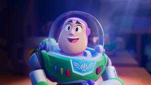
Gary> Wizz and I were contacted by Wieden+Kennedy to pitch on this project earlier this year. In their references for the project, they’d actually included two films I had the opportunity to direct and were also in that retro/’80s/nostalgic vibe (Starlord and the TMNT trailer). We were all super enthusiastic about the project despite a fairly tight schedule and we gave our all on the pitch which enabled us, on the one hand, to win the project (haha), but above all to really define the art direction and mood fairly quickly. For example, the first shot of Megan is almost 90% the same as we had it in the original pitch.
LBB> Tell us about the anthem song. Did it lead the animation?
Gary> It's quite rare in this industry, but yes indeed. The music already existed almost in its final version before we started the storyboard, so we were able to work out the structure and rhythm to suit the music. The initial version lasted around two minutes and 30 seconds. It took hard work, but I managed to make a one-minute edit that broadly matched the pacing of the original version while allowing us to construct something that was fun and epic. It was equally important to show the different aspects of Megan that make her a hero in the sport and in the LGBTQIA+ community.
LBB> Your background is in 3D but this 2D ‘80s game aesthetic is something you seem to have totally mastered. Why have you embraced this and how do you get it so spot on?
LBB> I grew up with these references and consumed a lot of cartoons as a kid in the ‘80s and ‘90s. It helped to have an older brother who was just as much of a nerd as I was. I watched a lot of VHS tapes and so it came naturally enough since I think these kinds of references are ingrained in my imagination. Then I was lucky enough to work on a trailer for TMNT - I felt like a kid again!) - which went over pretty well and since then it seems people think I've got the eye for it.
I think the trick with this kind of project is to find the balance between sincere homage without falling into silly parody by adding something more modern, especially in terms of direction (camera angles, etc.). I like that this aesthetic lets you do something over the top and be okay with that - an attitude which is very much the spirit of the ‘80s, in my opinion.
LBB> How did you develop the type throughout the film?
Gary> I designed the typography during the pitch process. It's another of my secret pleasures, I love doing logos and typefaces inspired by ‘80s cartoons or heavy metal band logos. In this case, the references were crystal-clear: ‘G.I. JOE’, ‘Mask’, ‘Thundercats’, etc. So again, something very over the top. The ‘Let It Rip’ title came a little later in the production. We collaborated more with the agency on the design. They wanted a neon feel and I added a touch of chrome in keeping with Megan's image in the film; a badass biker with pink hair.
LBB> I love the ‘Nike F.C. presents’ logo. How many iterations did this take to land and talk us through the process?
Gary> It was also created quite early on. I had initially made three different ones all more or less inspired by the ‘Filmation’ logo but playing up LGBTQIA+ representation with the rainbow side on the FC. We finally decided collectively on the one that's in the film. By the way, I love the sound design on this logo! I'd originally used the one from the Cannon films, for those who remember!
LBB> Who and what are you influenced by? Generally and for this film?
Gary> Definitely films, cartoons, video games and comics from 1980s and 1990s pop culture. Otherwise, very broadly from Japanese animation and the friends and people I work with.
For this project in particular, the inspiration is fairly obvious to most and I can see that people are already starting to identify some of our references. I looked at just about every cartoon theme song from the ‘80s and ‘90s to try and get the essence of them: ‘Silverhawk’, ‘Galaxy Rangers’ etc. The agency thought it was important that the references be very clearly American (even though we did include a nod to the Japanese anime ‘Akira’ in the end ). It was a bit of a challenge to try and emulate a retro all-American style, but it gives the film that great ‘America F&#@ Yeah!’ vibe.
LBB> What’s your favourite moment in the spot?
Gary> I really like the training montage in the middle of the film. It was one of the silly ideas that were in the original script that we kept (like the synth solo, for example) and I absolutely wanted there to be shots of computer interfaces, wireframes, etc. This was partly because most of the cartoons at the time had this futuristic/galactic feel to them and I’ve dreamt of doing it for a long time!
LBB> Will we ever get ‘MEGAAAN RAPINOE’ out of our heads?
Gary> Definitely not. It's one of the most effective tracks I've ever heard. And I'm not just saying that because I listened to it almost every day for weeks!


