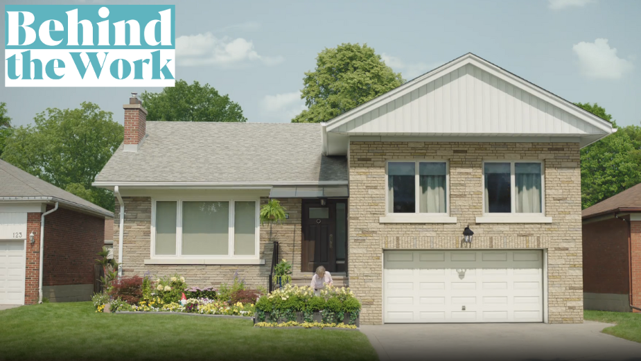
Look House Talking: How Ryan Ebner Brought a Regal Residence to Life for Equitable Bank

If your home could talk, what would it say? “Time to take out the trash, already!”, perhaps. Or maybe a polite request to arrange an appointment with a plumber. Alternatively, what if your home became your own enthusiastic investment partner?! In a recent spot from Feels Like Home Director Ryan Ebner for Equitable Bank, that wacky reality is full-heartedly embraced.
In the ad, we hear how homeowners can unlock their property’s equity thanks to Equitable Bank - but the message is delivered with a comedic and memorable twist. As an animated home springs to life in front of its owner, we hear how the pair have been enjoying caviar for brunch before embracing in a heartfelt - if somewhat surreal - moment.
For a category normally replete with sombre messaging and hard numbers in its marketing, the ad stands out like a, well, like a talking house. To go behind the scenes, LBB caught up with Ryan…
LBB> Ryan, what was your vision heading into this ad and how closely does it align with the finished spot?
Ryan> The biggest question was who is our house? Because that’s going to drive everything else. The creative team, André Yumbla-Bell and Lena Soliman, had a firm idea of the persona. They wanted a slightly aristocratic sounding house that one might remember seeing in past sitcoms featuring butlers. Their reference was awesome but when we got to animation style, we were forced with a very serious choice. Since the voice was going to be a bit over-the-top, we wanted to steer away from the house being too over-the-top as well. For instance, we were looking at highly animated styles like you’d see in Disney or Harry Potter movies. That felt too cartoony to me. We decided to go more organic with the house movements. Not to animate it all, but treat it as if we were making the entire house a puppet, and manipulating it practically with elements already in place. In the end, the contrast between his voice and his appearance created just the right balance.
LBB> The voice of the house is quite something! Why did you end up going in that eccentric-British direction?
Ryan> The voice was really all the creatives, André and Lena. Their vision was super clear from the beginning, and never really changed throughout the whole process. It was the foundation for the house’s character. Then we just built around it, no pun intended.
LBB> How did you know where to draw the line in terms of humanising the house whilst it still being, y'know, a house?
Ryan> Great question. It’s always hard to know when to stop with animation. But the litmus test for me was to ask myself, “Is this starting to feel like a commercial for kids?” If the answer was yes, then I knew we needed to back off a bit. I wanted that tasteful irreverence, that balance between absurdity and mundane reality needed to come through, loud and clear.
We had originally talked about animating the house’s lips moving: moving gutters, siding splitting open to form a mouth, etc., but we kept going back to the idea of keeping it as real as possible. How would that house move and talk and show emotion if it could only use its core foundational elements? Especially when the voiceover was so expressive. A lot of humanity was simply going to come from our voice actor.
LBB> What kind of location scouting process was involved, and how did you know you'd hit on the right spot?
Ryan> I think we did an initial scout, which is the norm, but we didn't really find it. Then we went two or three more rounds. We looked at a ton of homes. It was like casting for a human-speaking role. First of all, there’s the look. Did the house have a ‘face’ that could believably look human? Secondly, there was the issue of demographics. Was the house too upscale? Was it too low-brow? And then came the biggest issue for me, which was clutter. I really wanted a house that had a nice, normal, clean front yard space. Lots of the locations we looked at were 87% right. But there was a tree, a weird driveway, or a fire hydrant, that made it unusable. So, I love the tidiness of the house we found.
It had the space to present the house as an isolated character. That presentation helped give the spot an awkward stillness that made the house’s actions stick out like a sore thumb. Which was the whole point.
Of course, the chances of us finding the “perfect” house were small. So the talented folks at Rodeo helped us create a more human face on the facade we liked. With some clever replacement of windows, blinds, etc., it gave us the ability to anthropomorphize the house right off the bat.
LBB> What makes comedy such an effective delivery mechanism for a classic call-to-action like this ad?
Ryan> I think culture is saturated with the expected heart-string-tugging messaging for home loans, financial services and such. Soft, emotional stuff is great for some things, but honestly, it’s rarely done well.
I think Equitable Bank understands its audience and realises that they like to laugh and be entertained as well. They also know that comedy is a great way to stand out against the big spenders. I take my hat off to them for being bold enough to create something as proprietary as this. It will get noticed - and that’s exactly what really smart comedy can do in a sea of static.
LBB> What was the biggest challenge you faced and how did you overcome it?
Ryan> The biggest challenge for this project was creating the house’s character. Who exactly was he going to be? As I mentioned above, we overcame the hurdle by breaking it down into really important details like how the face is presented, how it moves, and how the voiceover glues it all together once we get into the final mix. Like any challenge in filmmaking, I rely heavily on my team at Feels Like Home. But also, the folks at Hive, the client at Equitable Bank, and all the people at Rodeo were the real reason this moved forward as smoothly as it did.
LBB> Is there anything that you'd do differently if you had your time again?
Ryan> This is an unfair question for me since I'm rarely satisfied with anything I do, but luckily everyone involved on this project made me happy with the outcome. I love how this turned out. I am still constantly learning on every shoot and after the fact, I see ways we could have streamlined one facet or made another scene more efficient. The need to always make things better is what keeps me interested in filmmaking and advertising. If I lose that passion, then it’s just a job. And I've never just wanted a job.
LBB> And finally - given that this interview is a safe space - be honest with us: Have you had any dreams/nightmares about your home talking to you since you started work on this ad?!
Ryan> Funny enough, I had an apartment in San Francisco years ago that had a vent to the roof in my bedroom closet. When heavy winds would come, it would create this whistling noise that I swear would sometimes say, “Heyyy, Ryannnn.” That apartment subsequently burned down in 1999. No one was injured.


