Tesco Uses Fresh Produce to Update Iconic Logo

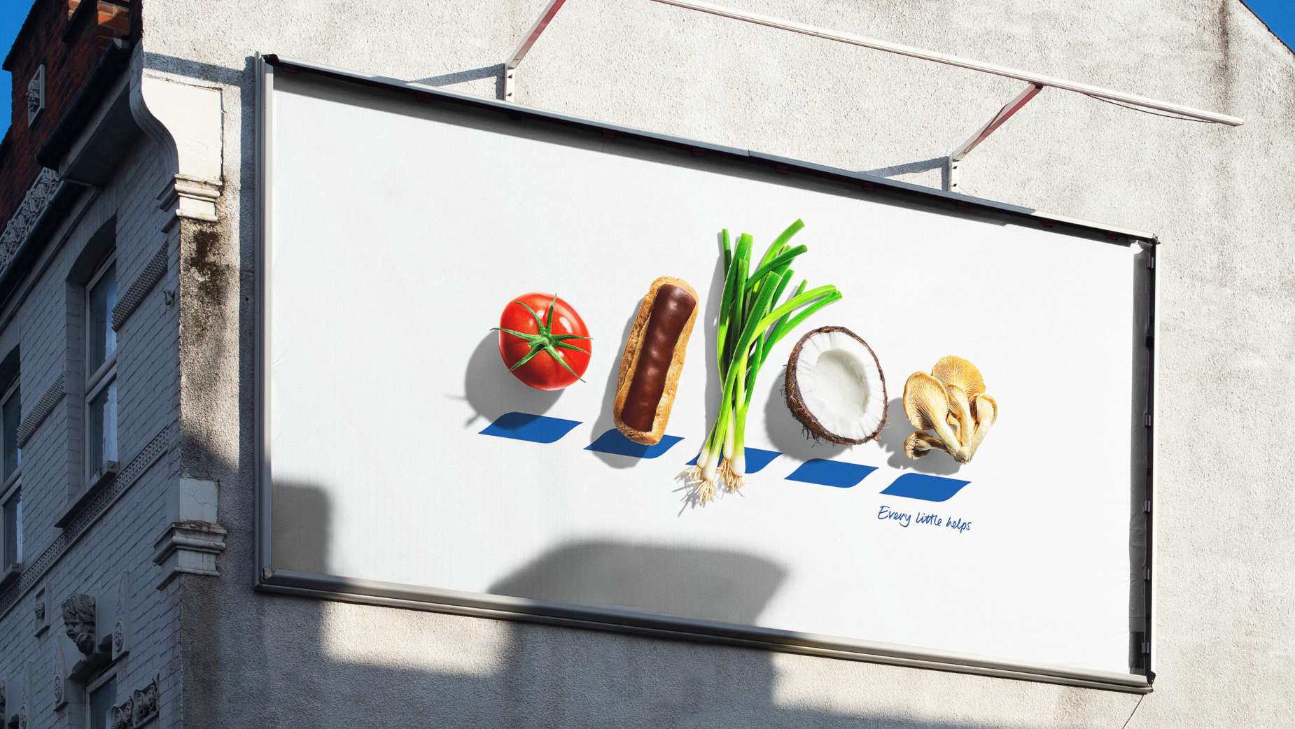
Tesco quite literally stands for quality food in a new OOH campaign by BBH London, which replaces the letters of its famous logo with beautiful fresh produce starting with T, E, S, C and O.
Called 'ICONS', the campaign is BBH’s response to a brief to make Tesco stand for quality food.
Conventional marketing wisdom dictates that you should never alter your established brand logo. BBH recognised, however, that even stripped back to its five blue chevrons, the Tesco brand identity is still unmistakeable, and saw it as an opportunity to do something iconic.

Aimed at everyone who loves their food, from a beefy tomato to a crispy fried egg, 'ICONS' uses beautiful photography by Will Cooper, who shot each item of produce with the same love and attention to detail that Tesco pays to sourcing it. And by replacing the letters of TESCO with food, the posters give passers-by a playful puzzle to work out and truly let the food do the talking.

Murray Bisschop, UK marketing director at Tesco, said, “We know quality is so important to our customers, regardless of whether they are treating themselves to a Finest steak or preparing a quick and economical stir fry. We wanted a campaign that heroes the quality of our products in a clever and beautiful way and we love how the campaign has turned out. I hope people will have fun guessing the letters and might even find some inspiration for their next meal too!”

Felipe Serradourada Guimaraes, deputy executive creative director at BBH, said, “You need to have icon status to be able to play with your logo with such confidence. We at BBH are lucky enough to have one of the most iconic brands out there, Tesco, and to work with a team which is willing to throw away the rule book which dictates how it’s used.”
The campaign breaks today (Monday 21st October), running OOH across the UK until 10th November.


