Why This Canadian Bank Reinvested in an Iconic Tagline

‘You’re Richer Than You Think’. It’s a tagline that, if you live in Canada, you’re well aware of. Whether you’re with Scotiabank or not, you’ve probably encountered the line somewhere, be it while waiting for the movies to start at the theatre, on a billboard somewhere, or while at home, watching TV.
However, seeing as the line was debuted in 2006, the team at Scotiabank felt it was high time to reconceptualise it for a modern audience, especially in a period when Canadians are spending a record amount of time worrying about their finances. And to this end, creative agency Rethink was more than ready to help, jumping in to launch a 360 degree campaign focusing on the small wins, and the ways in which the bank can be there when people need it most.
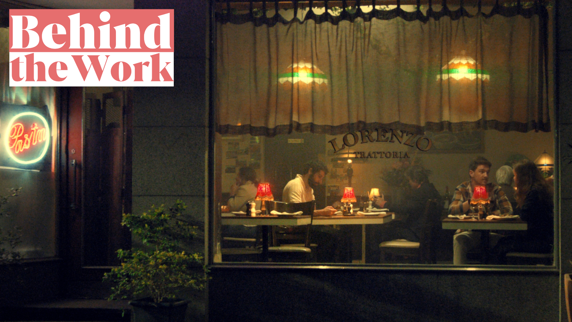
Centred around a 60-second spot, the creative depicts a series of people at restaurants, driving cars, and in their homes, going from casual to luxury - each looking on to the next with a sense of envy and longing for what they do not have. This scales to more and more extreme levels, until finally, it comes full circle, reminding audiences that there is far more to life than the pursuit of what they do not have, and that often, in chasing that, they miss out on the richness they already have around them.
To discuss more about how this came to life, and why this approach was the perfect way to avoid the category’s ‘sea of sameness’, LBB’s Josh Neufeldt sat down with Rethink’s creative directors, Brendan Scullion and Max Bingham, and group strategy director, Crystal Sales, as well as Scotiabank’s vice president, global brand management, John Rocco, and director of global brand management, Katie O’Donovan.
LBB> What was the brief for this campaign, and going in, did you want to bring back the ‘You’re Richer Than You Think’ tagline?
John> ‘You’re Richer Than You Think’ is one of Canada’s most well-known taglines, which is a big deal for a bank. Research tells us that Canadians have an affinity for the line, but we realised this was a moment where we needed to re-contextualise its meaning for today’s economic climate. As such, the brief was to re-establish ‘You’re Richer Than You Think’, giving it new life and a fresh perspective. We believe its new iteration and platform will continue to resonate with Canadians.
Brendan> Over the years, the tagline has been interpreted in different ways, and it was our opportunity to be deliberate with its meaning. The initial ideas varied. There were a lot of grandiose stories of people misconstruing what it means to be ‘rich’, but we found that any story that felt ungrounded or outside of the real world robbed the insight of its weight.
LBB> Building on this, how did you approach reconceptualising it for a modern audience? And what made now the right time to do so?
Crystal> We approached reframing the classic tagline for a modern audience by leaning into folks’ need for an empathetic and human relationship with their bank. Seeing how the future may feel daunting to some, we’ve evolved the platform to more accurately reflect the behaviour we’re seeing across Canada, and to show how Scotiabank can be there when the clients need it.
John> Our latest research shows us Canadians are spending a record amount of time worrying about their finances from paying for day-to-day expenses, to paying off debt, to saving for emergencies. As such, in the current economic environment, the future feels daunting, and this worry has surfaced the highly emotional relationship we all have with our money.
So, to reconceptualise it for a modern audience, we balanced the optimism that Canadians crave with the reality of the tough economic climate. We’re not sugar-coating the struggle - instead, we’re celebrating the small wins (like a date night with your partner) and providing solutions Canadians can actually use to improve their financial situation.

LBB> Obviously, this was a 360 degree campaign, which means a lot of work across the board. Where does one get started with this? Tell us about the initial ideation process!
Brendan> It starts with planting a flag in the ground, which meant finding the right articulation for this new era of ‘You’re Richer Than You Think’ in film.
That said, initial ideation was tricky. We talked a lot about how throughout our lives, we’ve had these ideas of what would make us ‘rich’ (shout out: ‘upgrading to a seat with extra leg room’) – but every time we got there, or even remotely close, there was no real sense that we’d actually made it. It was like the goalposts changed. We had a feeling, but not a film. Then, Mike Dubrick very casually threw out a really great thought (he has a habit of doing that) – and a few hours later we had a first draft.
LBB> With that in mind, why was the idea of people looking at others with more than them the right way to embody the idea of being richer than you think?
Max> The idea of each person looking at the next helps establish a simple point: if being ‘rich’ is defined by what you don’t have, you can never feel rich.
We felt this was the right vehicle for our message because not only did it help capture the feeling that there is no finish line, but it gave us an opportunity to showcase the extraordinary lives that are being overlooked. Each and every person distracted by the next thing is completely missing out on the richness that already exists around them.

LBB> Tell us about the writing process as a whole! How did you approach writing a series of scaling scenarios? And why was having it come full circle the perfect way to send this message?
Brendan> We had a beginning, and we had an end, but writing the route from A to B (well, technically A to A) was a very collaborative process. We drafted a ton of scenes and interconnected pathways to help create the arch of the spot, and then worked with both the brand team and the director to craft the right sequence.
Our goal with the larger structure was ultimately to shift perspectives, and so coming full circle was incredibly important. By ending back where we start, we challenge the viewer to consider the ‘richness’ they might be overlooking in their own lives.
LBB> Notably, the spot was directed by Radke’s Ian Schwartz. What made him the right person for the job?
Max> What immediately jumped out about Ian was his vision. Nothing in his approach felt or looked like a traditional bank ad, but it still felt quite real. Building these rich and vibrant spaces was fundamental to the journey of our story arc, and the fact that he did it while remaining flexible enough to adapt to the curveballs inherent with such an interconnected spot makes it all the more impressive.
LBB> What challenges did you face during this project, and how did you overcome them?
Max> The sun! We felt that dusk/night was the right time for this spot (both for story and the aesthetic), but executing that meant chasing daylight at sunset and then racing it before sunrise. Hats off to the entire production team for navigating a difficult shoot schedule. The spot wouldn’t feel the same without it.
Katie> Making a bank commercial that looks nothing like a bank commercial isn’t easy. It isn’t easy to brief, to approve, or to create, and so yes, we encountered challenges at every step.
Creatively, we approved an ad that took place in the evening which resulted in four consecutive overnight shoots. Lesson learned - only daytime ads moving forward!
Evolving our advertising more towards life and living, and away from focusing on banks and branches wasn’t easy either. But if you look at the category in Canada, it all looks the same. We all offer very similar products and services, so we have very little means to differentiate. As such, we knew that if we wanted to stand out, we would need to make some bold decisions.

LBB> What lessons have you learned in the making of this campaign?
Max> The value of perspective, and the joy of working with an incredible team.
John> Again, don’t approve an ad that takes place at night!
In seriousness, we learned that to truly stand out from the pack and use creativity as the ultimate lever for differentiation, we had to make brave choices and be comfortable being uncomfortable.
LBB> How does this campaign fit into Scotiabank’s branding for 2024 and beyond?
John> The new masterbrand spot represents a shift in the bank’s next era of brand marketing. Our big difference is part of an evolution rooted in emotion and empathy, and our new interpretation of what ‘You’re Richer Than You Think’ means to Canadians in today’s economic climate.
LBB> Finally, has making this campaign changed the way you look at your own life and finances? And is there anything Scotiabank would like to remind Canadians of with regards to their financial decision making?
Brendan> It absolutely has. And I can say from firsthand experience, it’s really refreshing.
John> Canadians know this already: there is more to life than more! Scotiabank has the advice, tools and products to truly help our clients make the most of what they have, and help them set themselves up for success in the future.


