Problem Solved: Crafting a Community for Snap's Lens Fest 2023

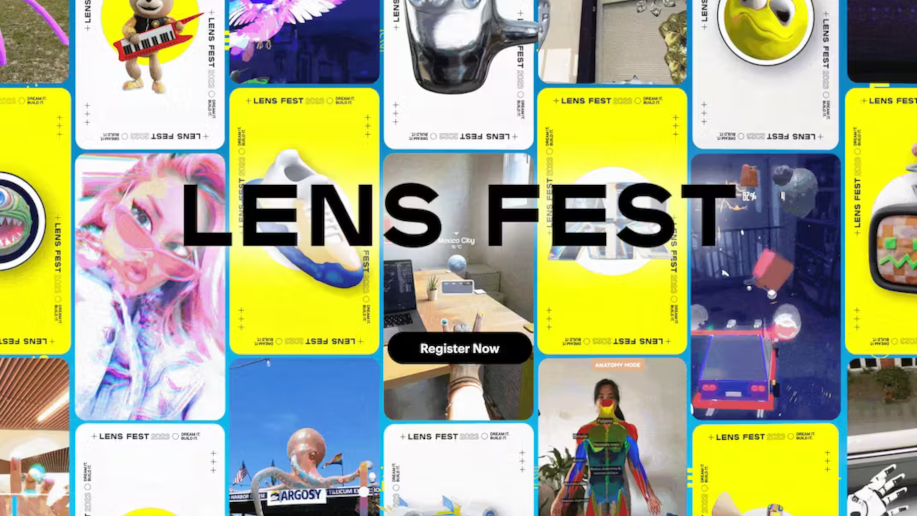
Brand New School created the strategy and developed the creative theme, look, and feel of Snap’s Lens Fest 2023 Conference event. This includes developing ideas for pre-event and post-event engagement, strategy, design, and the website. Plus, the live-action presentation/conference, complete with set design and an entire motion graphics package, the marketing materials, a web component, pre-production, production, and post-production.
The Problem
The initial brief from the client was to create a visual identity for Snap’s Lens Fest event, which could be activated across multiple implementations such as marketing, web and email, and, of course, the leading event/conference while taking into consideration Snap’s rich AR history and its rich community of creators. We needed to take a tech and social media company and present it as a fun and viable creative-based platform where artists and programmers can express themselves.
Ideation
Our first steps were to create a big concept on which everything would be built, take everything we knew about Snap, and package it into something singular with the same DNA. Ultimately, what caught hearts and minds was a concept we titled 'Community.'

We started with the brand pillars of Snap: World Class AR, Snap’s reach, and its robust creator community and creator platform. We used them as a springboard and leveraged a mixed-media approach to reflect the creator community's loud, bold, confident voice. Regarding the winning concept, we also wanted to feature creator-made assets while not losing the Snap branding. We created a design device called the 'Snap Card,' a container for all these assets that acted as a frame, window, or backdrop to any asset we threw at it. We used trading cards as inspiration. Ultimately, we liked the idea of artist trading cards, but with the Snap AR framing. We expanded the kit to incorporate other shapes in the long run, but the card was our first jumping-off point.
Prototype and Design
We worked closely with Snap to adjust our designs and concepts to coincide with what the internal team was cooking up. Snap was shifting from their black and yellow signature look to something more airy and light to suit the creative vibe they wanted. Everything needed to feel cohesive and work at a larger scale, so anything changed needed to be tested against the greater vision.
We had a team of designers, programmers, animators, and producers handling the gargantuan amount of elements we created. Regarding animation, we needed a workflow for animating 2D and 3D together. At first, we thought having an artist for each working together would yield the results we desired, but we had to pivot with the amount of elements needed. We eventually used After Effects and a newly implemented plug-in called Element that enabled each animator to work in 2D and 3D in one go, which made the production of these assets move much more quickly. As the project went on, we created a library of motion that became the language and could easily be picked up by any other designer or animator joining the team.

Live
You can design with the best intentions, but once things started moving in animation and websites were getting built, we needed to be open to letting go and pivoting as problems arose. We made sure we listened to everyone's concerns and input, and no matter the note, we made sure it looked good.
Looking back, the most exciting aspect of this project was the sheer size of it. I have worked for various conferences and product launches, but this was the first time every facet of an event had to be conceptualised. Usually, I’m focused on only one aspect of something, but I’m proud of the team for tackling such a massive ask. Brand New School and Snap worked hard together to create something fresh and unexpected for a tech company, and I hope they keep going with the vibes we developed together to bring Snap into its next era.


