Problem Solved: How YARD NYC transformed the TCS New York City Marathon

The New York City Marathon is the largest event of its kind. Its origins – and the stories it continues to produce – represent the best of what New York has to offer. The grit, the will, the diversity, the beauty, the sweat, the tears, the glory. It’s a five-borough celebration of perhaps the most famous melting pot in the world and has rallied thousands together every year since 1970, with two exceptions – 2012, when Hurricane Sandy made landfall on the east coast, and 2020, during the COVID-19 pandemic.
WHAT YOU MADE
Following a cancelled race in 2020, and severely reduced attendance numbers in 2021 in the aftermath of the pandemic, New York Road Runners were looking for a comeback worthy of an icon.
They turned to YARD NYC to breathe fresh life into its brand platform and to set the stage for the next 50 years of the TCS NYC Marathon. By redefining and broadening the scope of the marathon beyond just the runners, YARD NYC redefined participation as a collective act, made up of spectators, family members, volunteers, runners, and New York City itself.
The thoughtfully crafted multi-channel campaign that followed was impactful, emotional, and iconic and resulted in a surge of marathon applications so large it temporarily crashed the New York Road Runners’ digital platforms.
THE PROBLEM
Following the pandemic, New York Road Runners – the non-profit that organises the NYC marathon – wanted to come back bigger and stronger than ever after a few years of reduced capacity.
The brand platform, 'It Will Move You' had lost some of its vigour and wasn’t doing this iconic event justice.
It is true, however, that the NYC Marathon is one of its kind. Every year, runners and spectators from all over the world fly in and share the streets with New Yorkers from all walks of life to cheer for their families, friends, co-workers, and loved ones—or, to prove to themselves as runners that they can master a feat of physical excellence normally reserved for top athletes. All with the most iconic city in the world as the backdrop.
So while most races are by and large an experience exclusively for runners, the NYC Marathon uniquely touches everyone who takes part in it. It’s inspiring not just from a physical aspect, but equally as uplifting to feel a city like New York come together to celebrate the human spirit in all of us.
And this is what we found to be the driving force behind people’s participation in the big day. 'It Will Move You', in its current expression, was just scraping their surface. We needed to fully embrace the interconnected roles everyone plays in the NYC Marathon.
IDEATION
At first, New York Road Runners were willing to scrap what they had and start fresh. But we saw immense unrealised potential in 'It Will Move You' and wanted to start by flipping the declaration into a question that informed our approach. Who, exactly, will it move?
In the past, the answer to that question had been exclusively runners, with most of the communication being cantered around the pros. But this direction was missing what makes the New York Marathon so unique and beloved. Everyone takes part. And anyone can cross the finish line.
We wanted to shift the marketing focus away from mere running outputs, and back toward what makes people actually turn out on marathon day. We broke down the marathon into four pillars of equal importance: the runners, the spectators, the volunteers, and the city itself. These pillars became our organising principles through which everything else flowed.
In this process, we also identified another important shift in messaging. As we dug into the numbers and stories, we realised that it is also the size, scale, and sum of its parts that make the marathon so iconic.
So instead of prescribing in what way the marathon would move you, we wanted to invite our audience’s imagination and let them feel it for real. By letting the facts and statistics of the race speak for themselves, we filled runners, spectators, families, friends, and volunteers alike with pride and awe for what they were about to take part in.
PROTOTYPE & DESIGN
For us, being iconic is to be specific and simple. Less is more. This was especially true when designing a new, functional creative platform for the New York Road Runners.
Design played a significant role in how the brand world came to life and how we navigated creating many different assets. Inspired by the rich design history of New York City, we used the impressive nature of the race to create a suite of design elements and iconography that were timeless, elevated, and iconic in their simplicity. By embracing the impressive statistics that build up over the course of a year until race day, we were able to pair an inspiring and sophisticated voice with the power of simple design techniques.
Our mission started with photography. While New York Road Runners had a robust compendium of content captured from past races, the bulk of what made it to communications was mostly focused on the runners and didn’t paint a complete picture of the race. We were missing the key ingredients to what makes the marathon journey so special and what makes running New York City such a triumph: the emotion.
So much of the marathon takes place on the sidelines, in the in-between moments of connection, and in the juxtaposition of the tiny details against the grandeur of the city. With detailed briefs for the many photographers that collaborate with NYRR and a curated selection of images that brought all the emotional moments of the race and city coming together to life, we were able to capture the real drama of marathon day.
Then we began to build out a simplified, but mighty, design system that could tackle the many assets and locations that the communications would live in. We used New York-specific iconography as a base for the design system, which would then evolve into large-scale out-of-home and digital assets.
The course map became a visual representation of the journey that the runners, volunteers, and spectators accomplished over a year-long process.
This journey became our north star visually, evolving into what would become the 'It Will Move You' lockup. At the centre of the lockup, we see a simplified line that represents that adventure from the day the runner signs up to the day they race, volunteer, or spectate.
Adding motion played a large role in evolving the campaign from years past and using the dynamism in the brand patterns to infuse assets with the same momentum and motion that the marathon brings to the city. Maintaining this feeling of forward motion was essential to our design strategy and can be observed across the board in every element, from typography to banners to logos to animations.
We knew that due to the size and scale of the campaign, the output would need to be unified, simple, but striking, and in order to do that, we needed to create a flexible system that we could depend upon.
We used grid systems that were flexible against extreme vertical and horizontal placements; we intentionally selected photography, making sure to highlight the many different types of people that work towards race day; and we used messaging to transform how we see statistics. Using this as our base, we were able to create numerous amounts of creative, ranging from anticipatory-owned social posts, animated logo reveals, global magazine prints, and large-scale printed and digital out-of-home placements.
The design system had to transform to be continuously adaptive to the environment it was being placed in while also staying true to the part of the marathon journey it was highlighting. This meant we needed to find ways to refresh the system as it was being built, such as designing extreme verticals that made use of our countdown statistics or digital out-of-homes that used film to inspire people to participate.
The quantity of placements forced us to stay inspired visually and to push the boundaries of the limited colour range and imagery that we were operating under.

LIVE
As time ticked down to November 5th, contextual social posts and targeted emails helped support runners on their journeys.
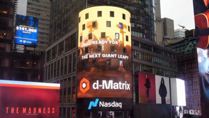
The work was unmissable throughout New York with takeovers in Times Square, on double-decker buses and subway takeovers, digital billboards, print ads, and at the Expo, which culminates all creative and marketing components before race day.
In the days leading up to Marathon Sunday, all these components built anticipation for the citywide block party that was about to go down. On race day, the stage was set for the city to erupt in the biggest marathon celebration to date.
When all was said and done and the final runner crossed the finish line, there were over 100,000 marathon applicants, a 51% increase from 2022.
The New York City Marathon app was downloaded over 500,000 times, an increase of 9.5% over the year before.
Overall, the campaign reached nearly 100M digital impressions for an increase of 120%.
By heightening the emotional power of the 'It Will Move You' platform, we were able to help breathe new life into a marathon over 50 years in the making. And we’re just getting started.


